Give us a call on
-
-
You may send an email
support@greenhightech.in
Give us a call on
You may send an email
Website Design
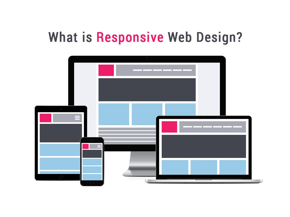
Web pages can be viewed using many different devices: desktops, tablets, and phones. Your web page should look good, and be easy to use, regardless of the device. Web pages should not leave out information to fit smaller devices, but rather adapt its content to fit any device. It is called responsive web design when you use CSS and HTML to resize, hide, shrink, enlarge, or move the content to make it look good on any screen. However, whenever we talk about responsive web design we should really think about this question: What problem does RWD solve?
The three main ingredients of RWD
Fluid Grids : First at all, a grid is a two-dimensional structure made up of a series of intersecting vertical and horizontal axes used to structure content. A fluid is a substance that constantly flows. The combination of both is a grid that reflows when the screen size changes. In other words they allow layouts to change. Most responsive grids include versions for at least three different browser widths.
Flexible images : One of the most challenging things in responsive web design is dealing with images. At the moment there are some techniques and tools available in order to serve true responsive images. Some good examples are Adaptive Images, a small PHP script that detects user screen sizes and creates the proper images for that screen size and Focal Point, a CSS framework that allows you to crop images and focus on its main point of interest.
Media queries : The third ingredient of RWD is media queries. These are an excellent way to deliver different styles for different devices and provide the best user-experience. As part of the CSS3 specification, media queries expand the role of the media attribute, which controls how styles are applied.

Director - Wampum Syntex Pvt. Ltd.